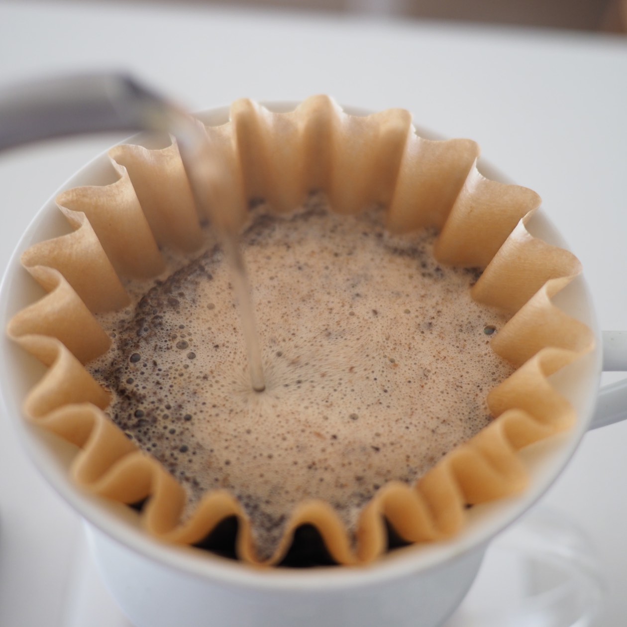
- Coffee
- 13.5g
- Water
- 202.5g
- Time
- 02:17
This is the ‘CSS Grid a day’ entry for May 16.
An example of using CSS grid every day, running from May 1–31st, 2019.
About this entry
The Third in the series of Milligram mockups. This one explores a 'Brewing Print' view. Back in 2015, I bought an Acaia Pearl Coffee Scale. It came with a handy app that allowed you to record your pourover brews with charts and nerdy details.
That app hasn’t seen a lot of love in recent years, it’s still not optimsed for iPhone 6 sized screens, let alone the new X-class devices.
Anyway I spent a little of this entry refactoring (and re-refactoring) the original Milligram navigation, so this entry ended up being less ambitious than I originally planned.
Still, I’d love me a good, modern application with brew charts and nerdy details. Filtru looks like a pretty cool modern app for these purposes.